What types of typographic alignments are available?
Before we get into what type of text alignment is best for your website, let’s first discuss the options…
Left Aligned Text
When lines of text are left aligned, they are flush on the left hand side and ragged on the right.
Example
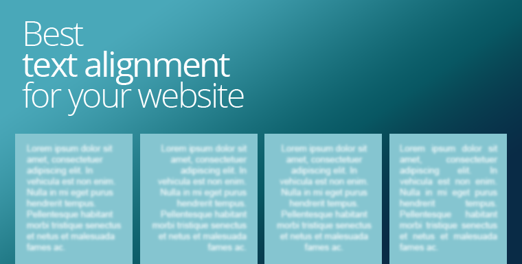
Lorem ipsum dolor sit amet, consectetuer adipiscing elit. In vehicula est non enim. Nulla in mi eget purus hendrerit tempus. Pellentesque habitant morbi tristique senectus et netus et malesuada fames ac turpis egestas.
Right Aligned Text
When lines of text are right aligned, they are flush on the right hand side and ragged on the left.
Example
Lorem ipsum dolor sit amet, consectetuer adipiscing elit. In vehicula est non enim. Nulla in mi eget purus hendrerit tempus. Pellentesque habitant morbi tristique senectus et netus et malesuada fames ac turpis egestas.
Center Aligned Text
When lines of text are center aligned, they are ragged on both the left and right.
Example
Lorem ipsum dolor sit amet, consectetuer adipiscing elit. In vehicula est non enim. Nulla in mi eget purus hendrerit tempus. Pellentesque habitant morbi tristique senectus et netus et malesuada fames ac turpis egestas.
Justified Text
When lines of text are justified, they are flush on both the left and right.
Example
Lorem ipsum dolor sit amet, consectetuer adipiscing elit. In vehicula est non enim. Nulla in mi eget purus hendrerit tempus. Pellentesque habitant morbi tristique senectus et netus et malesuada fames ac turpis egestas.
Which text alignment is best for your website?
Print media has been around a lot longer than digital media, and so we can look to traditional graphic design for the answer to today’s digital question. At least as a starting point. You may have noticed that:
- A4 sized documents and magazine articles are usually left aligned.
- Newspaper columns and books mostly use justified text.
- Poster text is often centered.
- Right aligned text is usually reserved for numbers in a column.
On websites you won’t often see centered or right aligned text, and this is probably because people intrinsically know that centered and right aligned text is not as easy or comfortable to read. That’s apart from headings and short sentences of course. There are instances where centered text can look great, like on a product banner, but centered text never looks good in long paragraphs. Likewise, right aligned text has it’s place, for example pricing and call to action buttons usually look best right aligned.
The main debate is really between those who advocate justified text instead of left aligned and vice versa.
The left aligned camp will point out that it’s not as easy to read justified text. Because every line is the same length, it’s easier to lose your place while reading. In contrast, the ragged right nature of left aligned text makes it easier to distinguish the line they just read from the line they are going to read.
The justified camp will point out that if newspapers and printed books use justified text, it can’t be all that bad. There are two major differences between websites and printed media like books and newspapers though:
1. Column Width
Newspapers don’t start their paragraph text on the left side of the page and stretch it all the way to the right. Instead they have multiple narrow columns. Narrow columns almost entirely eliminate the problem of losing ones place within the article. It’s easy for the eyes to keep track of which line they were on because the actual eye movement is minimal. Books don’t usually have multiple columns, but the paper size itself limits the width of the lines naturally.
If you’re not breaking up your justified text into narrower areas on your web page, it’s not as easy to read as left aligned text. That’s a fact. The W3C (World Wide Web Consortium) have stated this is particularly a problem for those with cognitive disabilities.
2. Hyphenated Text
Even if you do break your justified text up into columns, or narrower areas on your web page, you then encounter an entirely different readability problem. Letter spacing (aka kerning) between words becomes variable and unsightly. Here’s that justified text example again where you can clearly see the issue:
Look at the ugly spaces:
Lorem ipsum dolor sit amet, consectetuer adipiscing elit. In vehicula est non enim. Nulla in mi eget purus hendrerit tempus. Pellentesque habitant morbi tristique senectus et netus et malesuada fames ac turpis egestas.
The superficial neatness that you gain by justifying your text is offset by the gaps of varying width between words. Newspapers are able to get around this issue because they have this beautiful thing called a hyphen. Because newspapers have the ability to hyphenate words, the spacing between words becomes more uniform. Unfortunately, at this point in time, not all web browsers support hyphens.
- Here’s a nifty chart showing which browsers do and do not support hyphens.
If you see hyphens in the below example, then you are using a browser that supports them. If you still see the ugly spacing you are probably using an old browser or any version of Opera Mini.
Justified with hyphens:
Lorem ipsum dolor sit amet, consectetuer adipiscing elit. In vehicula est non enim. Nulla in mi eget purus hendrerit tempus. Pellentesque habitant morbi tristique senectus et netus et malesuada fames ac turpis egestas.
Summary
Qualified graphic designers are able to use their training and innate design talent to determine how best to display typographic elements, but for casual web builders, here is a useful guide:
- Avoid using right aligned text for paragraphs. Right aligned text is appropriate for numbers within columns, and potentially also ‘call to action’ buttons.
- Use centered text sparingly, and also not for paragraphs of text. Most headings should be left aligned, but there are cases where centered headings and short sentences can look good.
- If you are going to use justified text, make sure the lines of text are not too wide and that you use hyphenation (the css for this is: p{hyphens:auto}). Just keep in mind the lack of hyphenation support across browsers. The biggest defectors are old browsers (especially old Android browsers) and, at the time of writing, any version of Opera Mini.
- When in doubt use left aligned text
Article by Roxane Lapa of .COZA Web Design